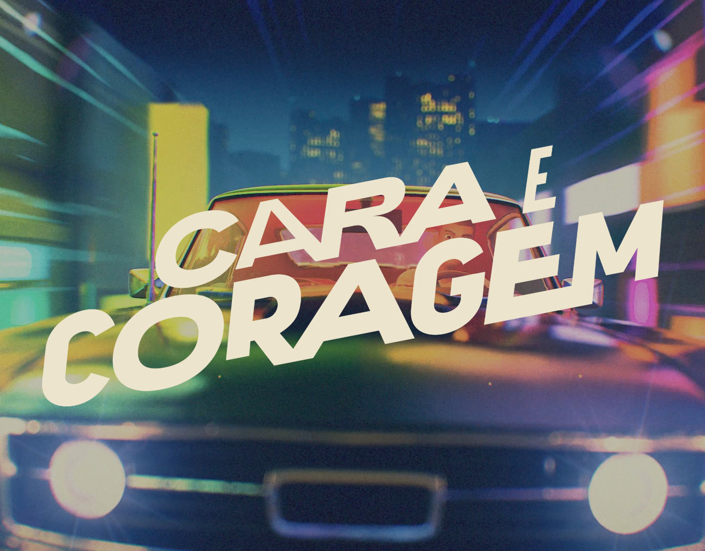
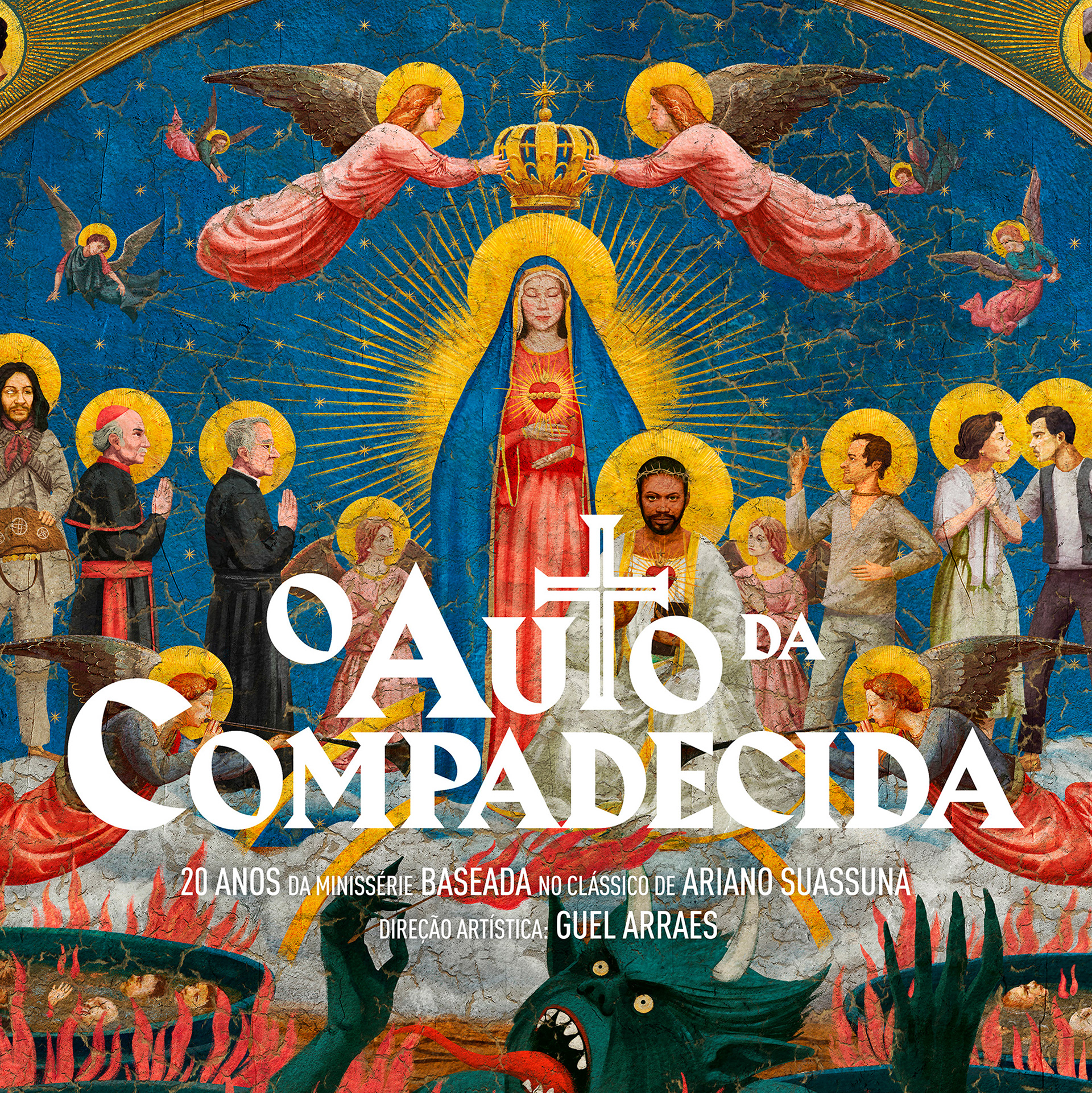
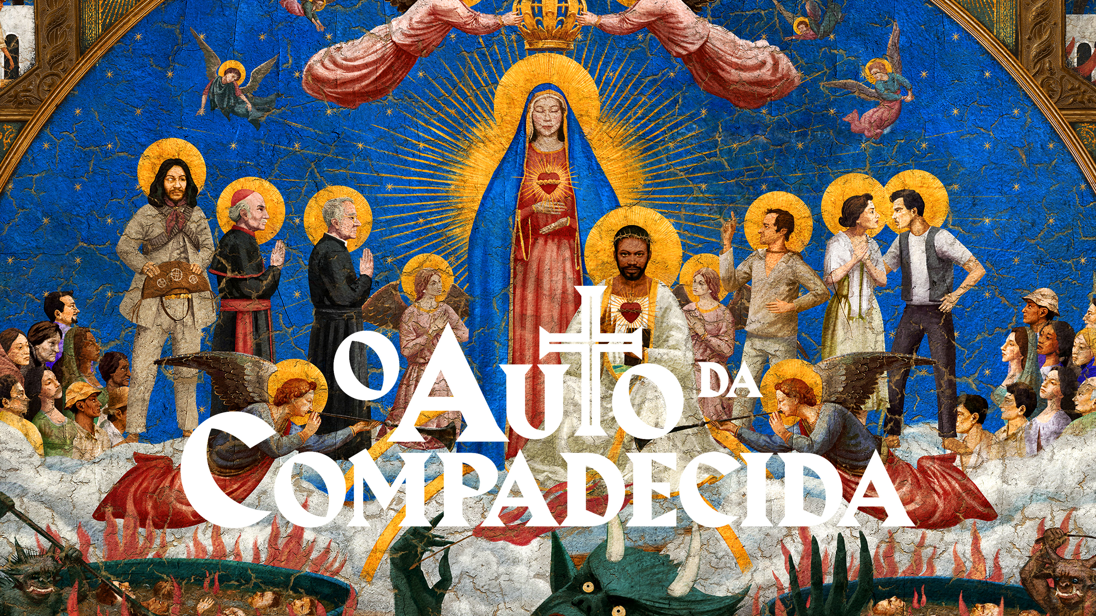
Clássico e popular, a abertura de "O Auto da Compadecida" remete aos trípticos bizantinos da era renascentista italiana. Com sua reestreia na rede de streaming Globoplay e remasterizado em 4K, a nova vinheta reposiciona o filme entre as grandes obras audiovisuais do cinema brasileiro de todos os tempos.
Classic and popular, the opening title of "Auto da Compadecida" recalls the byzantine triptyches of the Italian Renaissance era. Now it's available on the Globoplay streaming network and remastered in 4K, repositioning the film among the great audiovisual works of Brazilian cinema of all time.
O AUTO DA COMPADECIDA OPENING TITLE • ABERTURA FICHA TÉCNICA: Direção de Criação: Sergio Valente, Mariana Sá Direção Geral: Alexandre Romano Criação e Direção de Arte: Alexandre Romano, Christiano Calvet e Caramurú Baumgartner Motion Design e Animação: Renan de Moraes, Valerycka Rizzo e Bruno Meira Produção executiva: Orlando Martins Coordenação de Criação: Valerycka Rizzo Logo Design: Caramurú Baumgartner Storyboard: Caramurú Baumgartner Assistente de Criação: Gisele Ramalho Atendimento: Carla Sá, Suzana Prista, Letícia Eboli, Paula Machado Ilustrações e Concept Art: Koi Factory e Caramurú Baumgartner

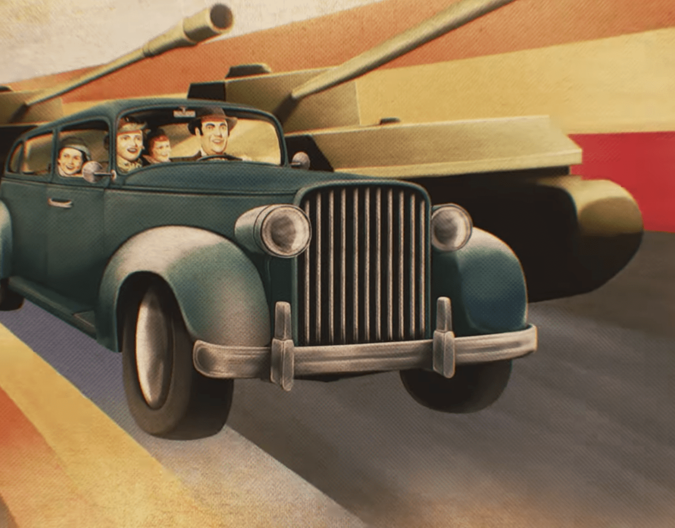
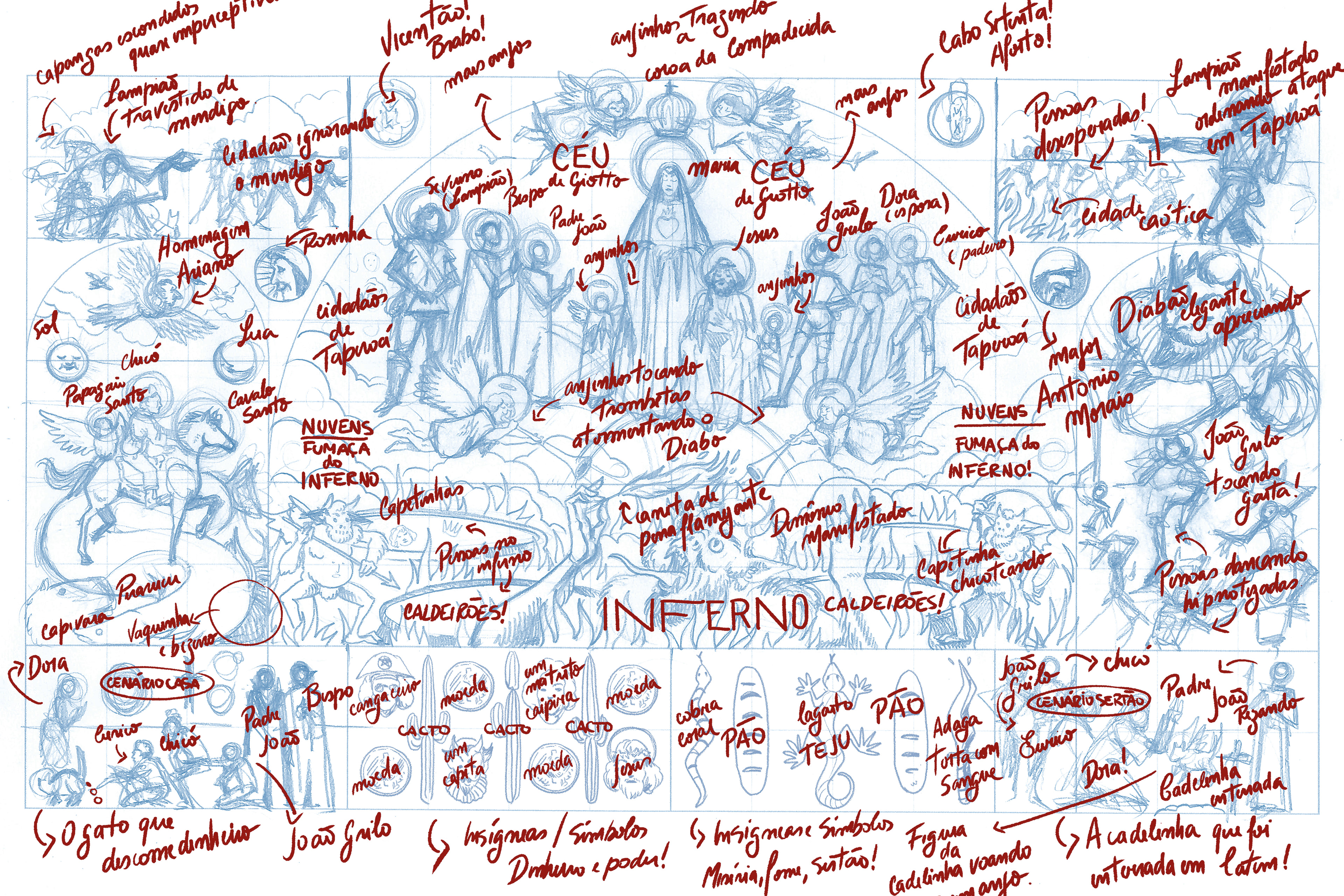
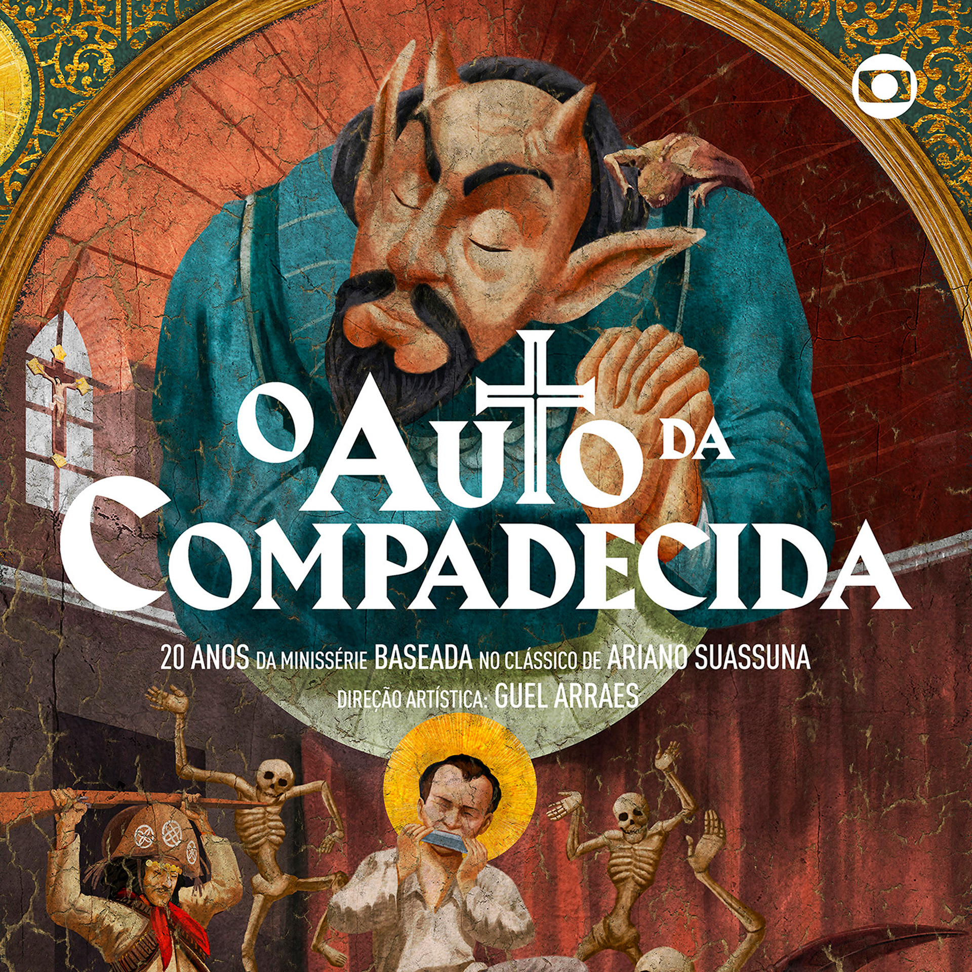
O mural também serviu de storyboard e roteiro para a abertura. Nele apresentamos os diversos detalhes da saga de Chicó e João Grilo contra a fome, a maldade dos tiranos, o abuso de poder e rumo, indo de encontro salvação divina.
The mural also served as a storyboard and script for the opening title. Where we present several details of the saga of Chicó and João Grilo against hunger, the evil of tyrants, the abuse of power and direction, going against divine salvation.
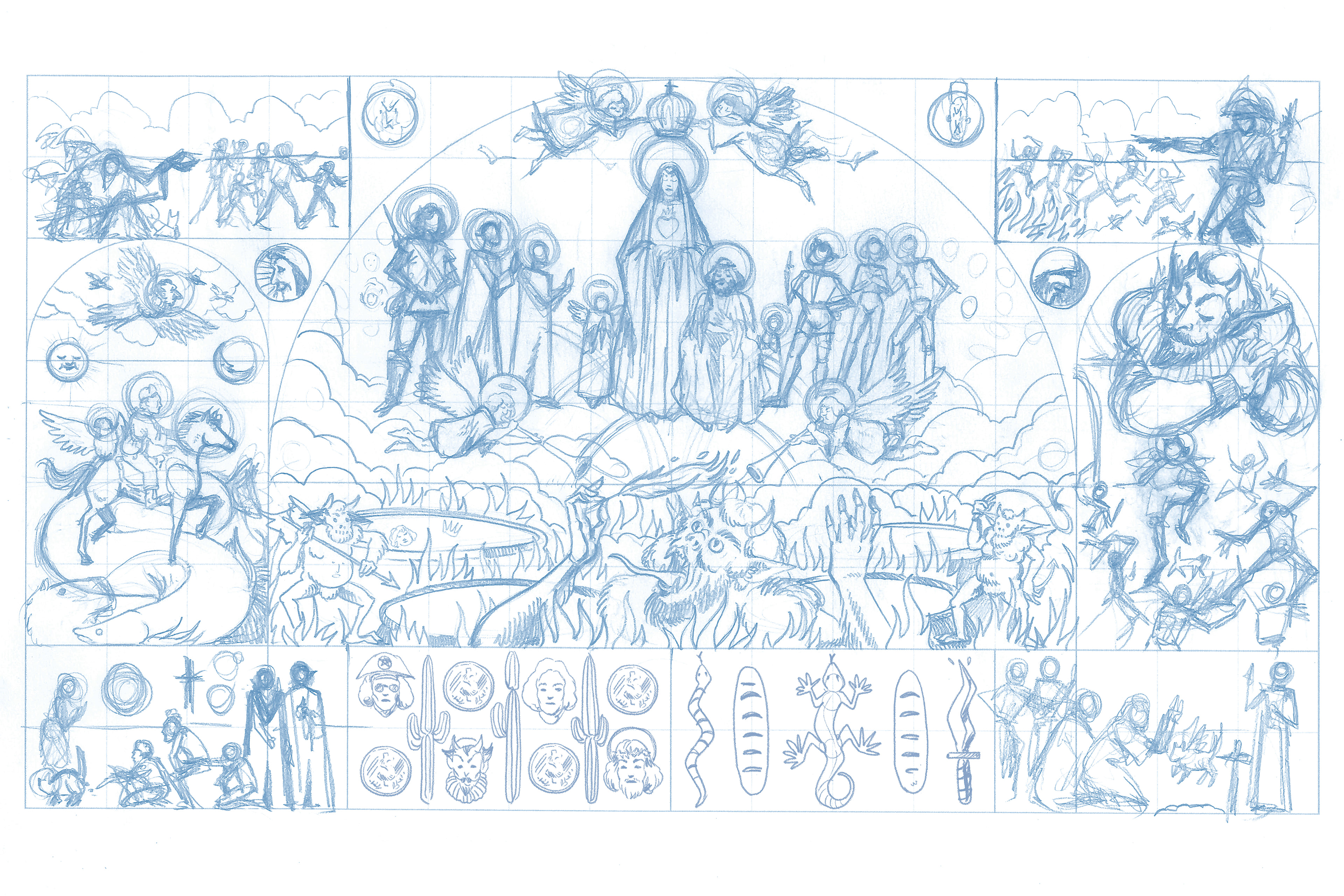

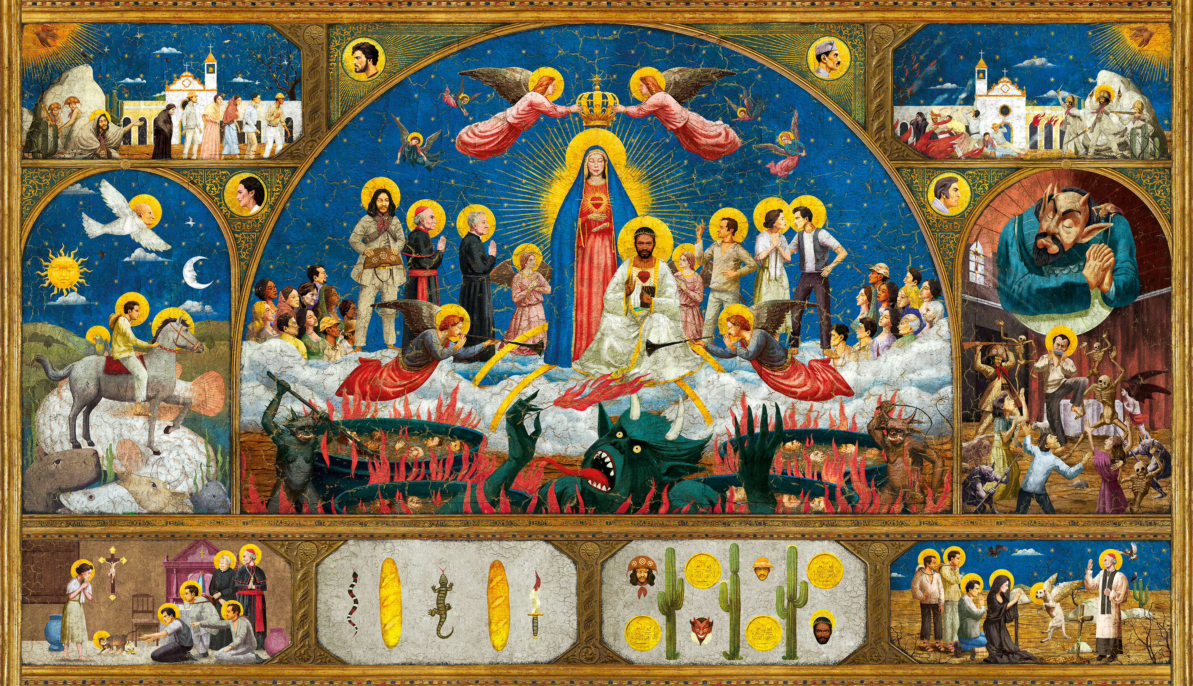
O mural inspirado em Fra Angélico e Giotto di Bondone, reproduzindo um clássico trípitco bizantino da do período renascentista italiano, remonta o enredo principal de O Auto da Compadecida, adaptação de Guel Arraes da homônima obra do mestre armorial Ariano Suassuna.
The mural inspired by Fra Angélico and Giotto di Bondone, reproducing a classic Byzantine triptych from the Italian Renaissance period, goes back to the main plot of O Auto da Compadecida, adapted by Guel Arraes from the homonymous work of the armorial master Ariano Suassuna.

Redesenhar o logo de O Auto da Compadecida foi um dos desafios mais deliciosos de se fazer. Não se podia simplesmente "mexer" no símbolo antigo para dar apenas um novo visual e sim ressignificar a reposicionar esse primoroso produto nacional através desse novo design e efeitos visuais, colococando-o no patamar que a obra merece: clássico, lendário, icônico e sacro. Utilizando o conceito que auto-intitulamos de "armorial às avessas", trouxemos para dentro da cultura popular nordestina a estética renascentista medieval européia.
O antigo logo de O Auto da Compadecida traz o completo sentimento vernacular, feito à mão e pelo popular. Através da sua aplicação xilográfica, apresenta as falhas e fissuras do veio da madeira que serviu de gabarito. A imagem também apresenta uma borda que cerca a tipografia, emoldurando-a.
O redesenho traz uma fonte com as serifas em ângulos de 45° que remetem ao uso de xilogravuras e tipografia com base em madeira justamente para ajudar no corte das letras. A diagramação traz uma forma triangular, para remeter a reverência aos céus. Além do T proporcionalmente exagerado e com uma cruz marcada reforçando a ligação de todo o enredo com a fé popular e da igreja.
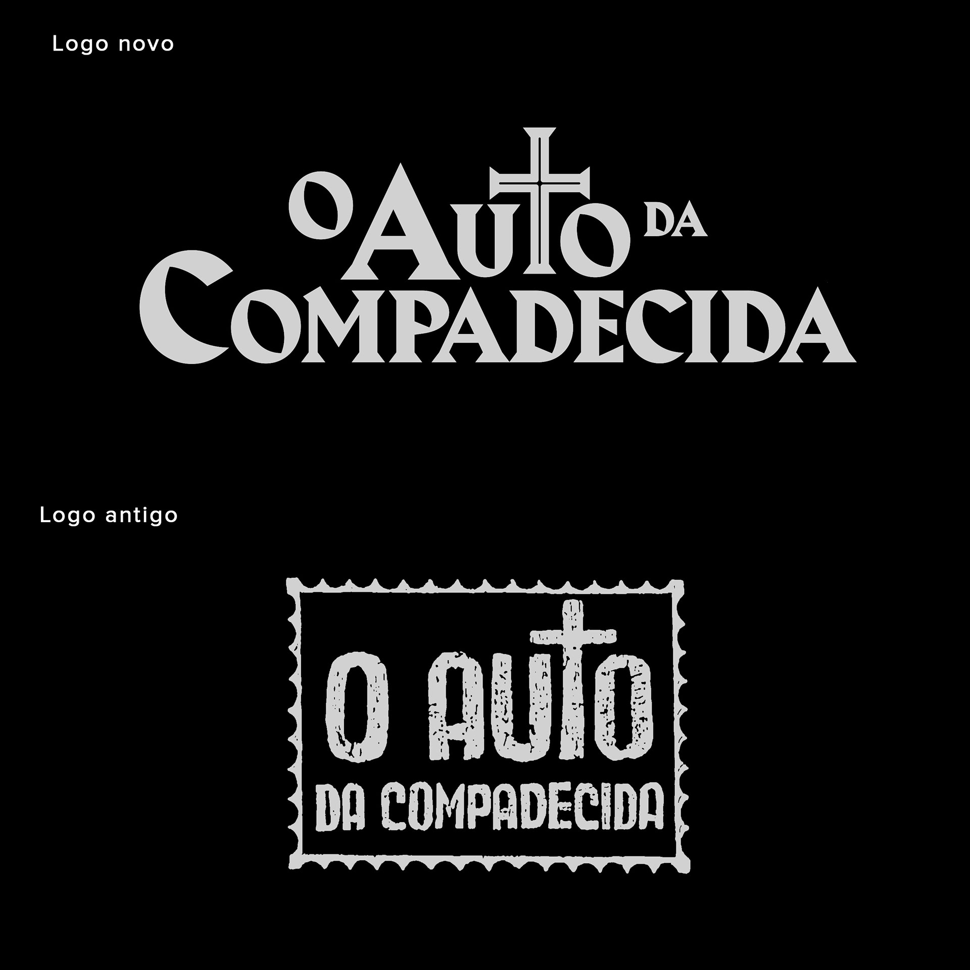
Redesigning the logo of O Auto da Compadecida was one of the most delicious challenges to do. It was not possible to simply "retouch" the old symbol to give only a new look, but to re-signify to reposition this exquisite national product through this new design and visual effects, placing it on the level that the work deserves: classic, legendary, iconic and sacred . Using the concept that we call ourselves "armorial inside out", we brought the European medieval Renaissance aesthetic into Northeastern popular culture.
The old logo of O Auto da Compadecida brings the complete vernacular feeling, made by hand and by the popular. Through its woodcut application, it presents the flaws and fissures of the wood grain that served as a template. The image also features a border surrounding the typography.
The redesign brings a font with serifs at 45 ° angles that refer to the use of woodcuts and wood-based typography to help cut the letters. The diagram has a triangular shape, to send reverence to the heavens. In addition to the proportionately exaggerated T and with a marked cross reinforcing the connection of the whole plot with the popular faith and the church.
Please follow me on instagram and click here to see more and buy prints.